


 Description
The plug-in affix helps in fixing the navigation section to an area on the page while scrolling the page up and down. An attribute data-spy=”affix” has to be added while using the Bootstrap Affix feature in projects.
Depending on the scroll position, the fix behavior will be turned on/off by using toggle plug-in. The plug-in toggles between 3 classes, they are:
In all the above three, the affix class is important as it makes to stick to the page while scrolling.
- affix-top : This class denotes that the element is placed in the top-most position.
- affix class : Whenever element starts to scroll, this class is added and it also fix the position by using the position: fixed property to element.
- affix-bottom : This class indicates the element is in the bottom position.
Example
[html]
<!DOCTYPE html>
<html lang="en">
<head>
<title>Bootstrap Case</title>
<meta charset="utf-8">
<meta name="viewport" content="width=device-width, initial-scale=1">
<link rel="stylesheet" href="http://maxcdn.bootstrapcdn.com/bootstrap/3.3.6/css/bootstrap.min.css">
<script src="https://ajax.googleapis.com/ajax/libs/jquery/1.12.0/jquery.min.js"></script>
<script src="http://maxcdn.bootstrapcdn.com/bootstrap/3.3.6/js/bootstrap.min.js"></script>
<style>
/* Note: Try to remove the following lines to see the effect of CSS positioning */
.affix {
top: 0;
width: 100%;
}
.affix + .container-fluid {
padding-top: 70px;
}
</style>
</head>
<body>
<div class="container-fluid" style="background-color:#D0D0D0 ;color:black;height:200px;">
<h1>Bootstrap Affix Example</h1>
<h3>Fixed (sticky) navbar on scroll</h3>
<p>Scroll this page to see how the navbar behaves with data-spy="affix".</p>
<p>The navbar is attached to the top of the page after you have scrolled a specified amount of pixels.</p>
</div>
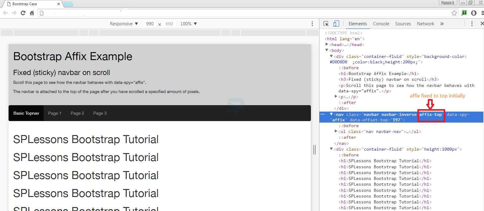
<nav class="navbar navbar-inverse" data-spy="affix" data-offset-top="197">
<ul class="nav navbar-nav">
<li class="active"><a href="#">Basic Topnav</a></li>
<li><a href="#">Page 1</a></li>
<li><a href="#">Page 2</a></li>
<li><a href="#">Page 3</a></li>
</ul>
</nav>
<div class="container-fluid" style="height:1000px">
<h1>SPLessons Bootstrap Tutorial</h1>
<h1>SPLessons Bootstrap Tutorial</h1>
<h1>SPLessons Bootstrap Tutorial</h1>
<h1>SPLessons Bootstrap Tutorial</h1>
<h1>SPLessons Bootstrap Tutorial</h1>
<h1>SPLessons Bootstrap Tutorial</h1>
<h1>SPLessons Bootstrap Tutorial</h1>
<h1>SPLessons Bootstrap Tutorial</h1>
<h1>SPLessons Bootstrap Tutorial</h1>
<h1>SPLessons Bootstrap Tutorial</h1>
<h1>SPLessons Bootstrap Tutorial</h1>
</div>
</body>
</html>
[/html]
Output: Before scrolling, the output will be as follows and initially the element is fixed to top as shown in the developer tools window.
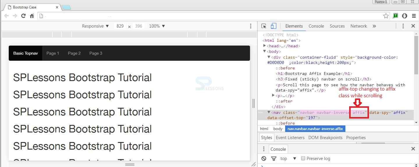
 While scrolling, the affix-top will change to affix class as shown in below image.
Description
The navigation menu can be fixed vertically. This time, the
dataspy="affix" is placed in ul element which has the class="nav nav-pills nav-stacked". Example
[html]
<!DOCTYPE html>
<html lang="en">
<head>
<title>Bootstrap Case</title>
<meta charset="utf-8">
<meta name="viewport" content="width=device-width, initial-scale=1">
<link rel="stylesheet" href="http://maxcdn.bootstrapcdn.com/bootstrap/3.3.6/css/bootstrap.min.css">
<script src="https://ajax.googleapis.com/ajax/libs/jquery/1.12.0/jquery.min.js"></script>
<script src="http://maxcdn.bootstrapcdn.com/bootstrap/3.3.6/js/bootstrap.min.js"></script>
<style> /* Note: Try to remove the following lines to see the effect of CSS positioning */
.affix {
top: 20px;
}
.nav-pills > li.active > a, .nav-pills > li.active > a:focus {
color: black;
background-color: #D0D0D0 ;
}
.nav-pills > li > a {
color:red;
}
</style>
</head>
<body>
<div class="container-fluid" style="background-color:#D0D0D0;color:black;height:200px;">
<h1>Bootstrap Affix Example</h1>
<h3>Fixed (sticky) vertical sidenav on scroll</h3>
<p>Scroll this page to see how the left navigation menu behaves with data-spy="affix".</p>
<p><strong>The left menu sticks to the page after you have scrolled a specified amount of pixels.</strong></p>
</div>
<br>
<div class="container">
<div class="row">
<nav class="col-sm-3">
<ul class="nav nav-pills nav-stacked black" data-spy="affix" data-offset-top="205">
<li class="active"><a href="#section1">Section 1</a></li>
<li><a href="#section2">Section 2</a></li>
<li><a href="#section3">Section 3</a></li>
</ul>
</nav>
<div class="col-sm-9">
<h1>SPLessons Bootstrap Tutorial</h1>
<h1>SPLessons Bootstrap Tutorial</h1>
<h1>SPLessons Bootstrap Tutorial</h1>
<h1>SPLessons Bootstrap Tutorial</h1>
<h1>SPLessons Bootstrap Tutorial</h1>
<h1>SPLessons Bootstrap Tutorial</h1>
<h1>SPLessons Bootstrap Tutorial</h1>
<h1>SPLessons Bootstrap Tutorial</h1>
<h1>SPLessons Bootstrap Tutorial</h1>
<h1>SPLessons Bootstrap Tutorial</h1>
<h1>SPLessons Bootstrap Tutorial</h1>
</div>
</div>
</div>
</body>
</html>
[/html]
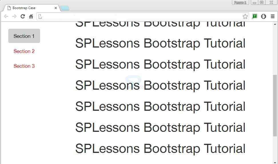
Output:The following output appears when the element is scrolled. The vertical navigation menu gets fixed to the page.
Key Points
- Bootstrap Affix sticks the navigation bar to top/bottom while scrolling.
- Affix plug-in is applied for pages that have more content.
- It uses the attribute dataspy="affix".