


 Description
Bootstrap 3 provides an option to apply different styles to buttons, which when applied gives a unique look to buttons. Buttons supports seven different styles.
.btn .btn-deafult- Standard button.btn .btn-primary- Identifies the primary action in a set of buttons.btn .btn-success- Indicates a successful or positive action.btn .btn-info- Contextual button for informational alert messages.btn .btn-warning- Indicates caution should be taken with this action.btn .btn-danger- Indicates a potentially negative action.btn .btn-link- De-emphasize a button by making it look like a link while maintaining button behavior
Note :
The.btn will give default styling to buttons and second class such as .btn-primary, and .btn-success will provide unique colors based on their names. Example
[html]
<!DOCTYPE html>
<html lang="en">
<head>
<meta charset="utf-8">
<meta http-equiv="X-UA-Compatible" content="IE=edge">
<meta name="viewport" content="width=device-width, initial-scale=1">
<!-- The above 3 meta tags *must* come first in the head; any other head content must come *after* these tags -->
<title>SPLessons - Bootstrap Buttons</title>
<!-- Bootstrap -->
<link href="https://maxcdn.bootstrapcdn.com/bootstrap/3.3.4/css/bootstrap.min.css" rel="stylesheet">
<link href="https://maxcdn.bootstrapcdn.com/bootstrap/3.3.4/css/bootstrap-theme.min.css" rel="stylesheet">
</head>
<body>
<div class="container">
<h2> <a href="http://www.splessons.com/lesson/bootstrap-3-tutorial/"> Bootstrap Buttons </a> </h2>
<button type="button" class="btn btn-default">Default</button>
<button type="button" class="btn btn-primary">Primary</button>
<button type="button" class="btn btn-success">Success</button>
<button type="button" class="btn btn-info">Info</button>
<button type="button" class="btn btn-warning">Warning</button>
<button type="button" class="btn btn-danger">Danger</button>
<button type="button" class="btn btn-link">Link</button>
</div>
<!-- jQuery (necessary for Bootstrap's JavaScript plugins) -->
<script src="https://ajax.googleapis.com/ajax/libs/jquery/1.11.2/jquery.min.js"></script>
<!-- Include all compiled plugins (below), or include individual files as needed -->
<script src="https://maxcdn.bootstrapcdn.com/bootstrap/3.3.4/js/bootstrap.min.js"></script>
</body>
</html>
[/html]
Output:

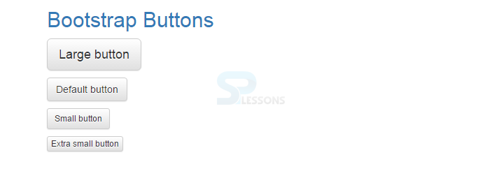
Description
Bootstrap 3 provides different sizes of buttons such as:
.btn .btn-default- Default button.btn .btn-default .btn-lg- Large button.btn .btn-default .btn-sm- Small button.btn .btn-default .btn-xs- Extra small button
.btn-lg, .btn-sm, or .btn-xs to buttons. Example
[html]
<!DOCTYPE html>
<html lang="en">
<head>
<meta charset="utf-8">
<meta http-equiv="X-UA-Compatible" content="IE=edge">
<meta name="viewport" content="width=device-width, initial-scale=1">
<!-- The above 3 meta tags *must* come first in the head; any other head content must come *after* these tags -->
<title>SPLessons - Buttons</title>
<!-- Bootstrap -->
<link href="https://maxcdn.bootstrapcdn.com/bootstrap/3.3.4/css/bootstrap.min.css" rel="stylesheet">
<link href="https://maxcdn.bootstrapcdn.com/bootstrap/3.3.4/css/bootstrap-theme.min.css" rel="stylesheet">
</head>
<body>
<div class="container">
<h2> <a href="http://www.splessons.com/lesson/bootstrap-3-tutorial/"> Bootstrap Button </a> </h2>
<p><button type="button" class="btn btn-default btn-lg">Large button</button></p>
<p><button type="button" class="btn btn-default">Default button</button></p>
<p><button type="button" class="btn btn-default btn-sm">Small button</button></p>
<p><button type="button" class="btn btn-default btn-xs">Extra small button</button></p>
</div>
<!-- jQuery (necessary for Bootstrap's JavaScript plugins) -->
<script src="https://ajax.googleapis.com/ajax/libs/jquery/1.11.2/jquery.min.js"></script>
<!-- Include all compiled plugins (below), or include individual files as needed -->
<script src="https://maxcdn.bootstrapcdn.com/bootstrap/3.3.4/js/bootstrap.min.js"></script>
</body>
</html>
[/html]
Output:
Description
Block level buttons can be created by adding 
.btn-block class to buttons. It takes the entire width of parent.
[html]
<!DOCTYPE html>
<html lang="en">
<head>
<meta charset="utf-8">
<meta http-equiv="X-UA-Compatible" content="IE=edge">
<meta name="viewport" content="width=device-width, initial-scale=1">
<!-- The above 3 meta tags *must* come first in the head; any other head content must come *after* these tags -->
<title>SPLessons - Bootstrap Buttons</title>
<!-- Bootstrap -->
<link href="https://maxcdn.bootstrapcdn.com/bootstrap/3.3.4/css/bootstrap.min.css" rel="stylesheet">
<link href="https://maxcdn.bootstrapcdn.com/bootstrap/3.3.4/css/bootstrap-theme.min.css" rel="stylesheet">
</head>
<body>
<div class="container">
<h2> <a href="http://www.splessons.com/lesson/bootstrap-3-tutorial/"> Bootstrap Buttons </a> </h2>
<button type="button" class="btn btn-primary btn-lg btn-block">Block level button</button>
<button type="button" class="btn btn-default btn-lg btn-block">Block level button</button>
</div>
<!-- jQuery (necessary for Bootstrap's JavaScript plugins) -->
<script src="https://ajax.googleapis.com/ajax/libs/jquery/1.11.2/jquery.min.js"></script>
<!-- Include all compiled plugins (below), or include individual files as needed -->
<script src="https://maxcdn.bootstrapcdn.com/bootstrap/3.3.4/js/bootstrap.min.js"></script>
</body>
</html>
[/html]
Output:
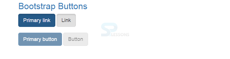
Description
Active or Disabled buttons can be created by adding
.active class and disabled="disabled" to buttons. Example
[html]
<!DOCTYPE html>
<html lang="en">
<head>
<meta charset="utf-8">
<meta http-equiv="X-UA-Compatible" content="IE=edge">
<meta name="viewport" content="width=device-width, initial-scale=1">
<!-- The above 3 meta tags *must* come first in the head; any other head content must come *after* these tags -->
<title>SPLessons - Bootstrap Buttons</title>
<!-- Bootstrap -->
<link href="https://maxcdn.bootstrapcdn.com/bootstrap/3.3.4/css/bootstrap.min.css" rel="stylesheet">
<link href="https://maxcdn.bootstrapcdn.com/bootstrap/3.3.4/css/bootstrap-theme.min.css" rel="stylesheet">
</head>
<body>
<div class="container">
<h2> <a href="http://www.splessons.com/lesson/bootstrap-3-tutorial/"> Bootstrap Buttons </a> </h2>
<a href="#" class="btn btn-primary btn-lg active" role="button">Primary link</a>
<a href="#" class="btn btn-default btn-lg active" role="button">Link</a>
<br/><br/>
<button type="button" class="btn btn-lg btn-primary" disabled="disabled">Primary button</button>
<button type="button" class="btn btn-default btn-lg" disabled="disabled">Button</button>
</div>
<!-- jQuery (necessary for Bootstrap's JavaScript plugins) -->
<script src="https://ajax.googleapis.com/ajax/libs/jquery/1.11.2/jquery.min.js"></script>
<!-- Include all compiled plugins (below), or include individual files as needed -->
<script src="https://maxcdn.bootstrapcdn.com/bootstrap/3.3.4/js/bootstrap.min.js"></script>
</body>
</html>
[/html]
Output:
Key Points
The current chapter draws out the following important points.
- Buttons are the elements that gives some information or does some action when clicked on it.
- To add different large or small buttons, use .btn-lg, .btn-sm, or .btn-xs to buttons.
- Block level buttons occupies the entire width of parent.