


 Description
Bootstrap Collapse Plug-in is used to show or hide a large content. This is mainly used when working with Bootstrap Accordion.
Example
In the below example, a collapsible element is indicated by .collapse class, which shows or hides the content when clicked on a button.
Attribute data-toggle="collapse" is used to control (show/hide) the collapsible content. This is placed in <button> or a <a> element and add the data-target="#id" attribute to connect the button and the collapsible content (<div id="demo">).
Note:Instead of the data-target attribute, <a> element can be used with href attribute.
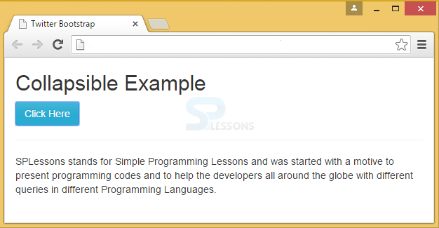
[html]
<!DOCTYPE html>
<html>
<head>
<title>Twitter Bootstrap : Popover Positioning using Javascript </title>
<link rel="stylesheet"
href="http://netdna.bootstrapcdn.com/bootstrap/3.1.0/css/bootstrap.min.css">
<link rel="stylesheet"
href="http://netdna.bootstrapcdn.com/bootstrap/3.1.0/css/bootstrap-theme.min.css">
<script src="http://code.jquery.com/jquery.min.js"></script>
<script src="http://netdna.bootstrapcdn.com/bootstrap/3.1.0/js/bootstrap.min.js"></script>
</head>
<body>
<div class="container">
<h2>Collapsible Example</h2>
<button type="button" class="btn btn-info" data-toggle="collapse" data-target="#demo">Click Here</button><br><hr>
<div id="demo" class="collapse">
SPLessons stands for Simple Programming Lessons and was started with a motto to to help the developers all around the globe by presenting programming codes for different queries in different programming languages.
</div>
</div>
</body>
</html>
[/html]
Output:
More Info
Collapsible content is hidden by default. However, .in class can be added to show the content by default.
[html]
<!DOCTYPE html>
<html>
<head>
<meta name="viewport" content="width=device-width, initial-scale=1">
<link rel="stylesheet" href="http://maxcdn.bootstrapcdn.com/bootstrap/3.3.6/css/bootstrap.min.css">
<script src="https://ajax.googleapis.com/ajax/libs/jquery/1.12.0/jquery.min.js"></script>
<script src="http://maxcdn.bootstrapcdn.com/bootstrap/3.3.6/js/bootstrap.min.js"></script>
</head>
<body>
<div class="container">
<h2>Simple Collapsible</h2>
<button type="button" class="btn btn-info" data-toggle="collapse" data-target="#demo">Simple collapsible</button>
<div id="demo" class="collapse in">
SPLessons stands for Simple Programming Lessons and was started with a motto to help the developers all around the globe by presenting programming codes for different queries in different programming languages.
</div>
</div>
</body>
</html>
[/html]
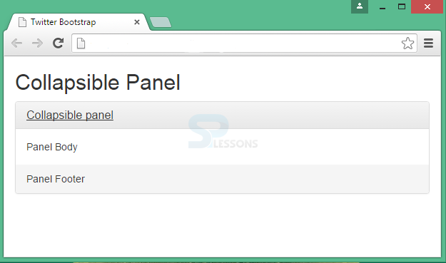
Description
Bootstrap Panel is a bordered box with some padding around its content.
Example
[html]
<!DOCTYPE html>
<html>
<head>
<title>Twitter Bootstrap </title>
<link rel="stylesheet"
href="http://netdna.bootstrapcdn.com/bootstrap/3.1.0/css/bootstrap.min.css">
<link rel="stylesheet"
href="http://netdna.bootstrapcdn.com/bootstrap/3.1.0/css/bootstrap-theme.min.css">
<script src="http://code.jquery.com/jquery.min.js"></script>
<script src="http://netdna.bootstrapcdn.com/bootstrap/3.1.0/js/bootstrap.min.js"></script>
</head>
<body>
<div class="container">
<h2>Collapsible Panel</h2>
<div class="panel-group">
<div class="panel panel-default">
<div class="panel-heading">
<h4 class="panel-title">
<a data-toggle="collapse" href="#collapse1">Collapsible panel</a>
</h4>
</div>
<div id="collapse1" class="panel-collapse collapse">
<div class="panel-body">Panel Body</div>
<div class="panel-footer">Panel Footer</div>
</div>
</div>
</div>
</div>
</body>
</html>
[/html]
Output:
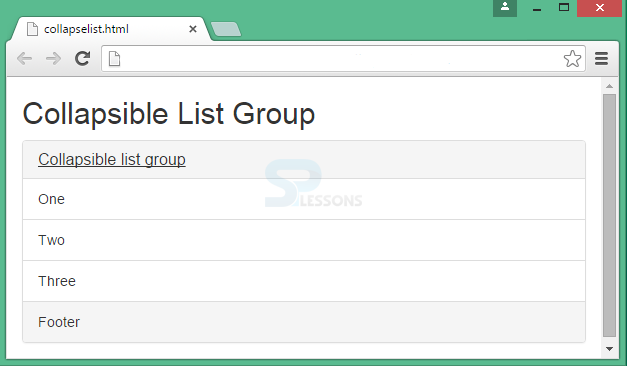
 To display the list items in an attractive manner, List Group, an unordered list is used.
[html]
<!DOCTYPE html>
<html>
<head>
<meta name="viewport" content="width=device-width, initial-scale=1">
<link rel="stylesheet" href="http://maxcdn.bootstrapcdn.com/bootstrap/3.3.6/css/bootstrap.min.css">
<script src="https://ajax.googleapis.com/ajax/libs/jquery/1.12.0/jquery.min.js"></script>
<script src="http://maxcdn.bootstrapcdn.com/bootstrap/3.3.6/js/bootstrap.min.js"></script>
</head>
<body>
<div class="container">
<h2>Collapsible List Group</h2>
<div class="panel-group">
<div class="panel panel-default">
<div class="panel-heading">
<h4 class="panel-title">
<a data-toggle="collapse" href="#collapse1">Collapsible list group</a>
</h4>
</div>
<div id="collapse1" class="panel-collapse collapse">
<ul class="list-group">
<li class="list-group-item">One</li>
<li class="list-group-item">Two</li>
<li class="list-group-item">Three</li>
</ul>
<div class="panel-footer">Footer</div>
</div>
</div>
</div>
</div>
</body>
</html>
[/html]
Output:
To display the list items in an attractive manner, List Group, an unordered list is used.
[html]
<!DOCTYPE html>
<html>
<head>
<meta name="viewport" content="width=device-width, initial-scale=1">
<link rel="stylesheet" href="http://maxcdn.bootstrapcdn.com/bootstrap/3.3.6/css/bootstrap.min.css">
<script src="https://ajax.googleapis.com/ajax/libs/jquery/1.12.0/jquery.min.js"></script>
<script src="http://maxcdn.bootstrapcdn.com/bootstrap/3.3.6/js/bootstrap.min.js"></script>
</head>
<body>
<div class="container">
<h2>Collapsible List Group</h2>
<div class="panel-group">
<div class="panel panel-default">
<div class="panel-heading">
<h4 class="panel-title">
<a data-toggle="collapse" href="#collapse1">Collapsible list group</a>
</h4>
</div>
<div id="collapse1" class="panel-collapse collapse">
<ul class="list-group">
<li class="list-group-item">One</li>
<li class="list-group-item">Two</li>
<li class="list-group-item">Three</li>
</ul>
<div class="panel-footer">Footer</div>
</div>
</div>
</div>
</div>
</body>
</html>
[/html]
Output:
Key Points
- Bootstrap Collapse is used to show or hide a large content with a class .collapse.
- In order to show the content inside collapse by default, .in class is used.