


 Description
To make Bootstrap attractive and more easy to use, Bootstrap Helpers classes are used. Bootstrap Helpers explains the following topics:
- Close Icon
- Carets Icon
- Quick Floats
- Clear Fix
- Center Content Blocks
- Contextual Backgrounds
- Showing and Hiding Content
- Screen Reader Content
Description
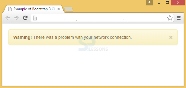
Close icon will dismiss the alerts and modal content. For this, “close” class is used.
[html]
<!DOCTYPE html>
<html lang="en">
<head>
<meta charset="UTF-8">
<title>Example of Bootstrap 3 Close Icon</title>
<link rel="stylesheet" href="https://maxcdn.bootstrapcdn.com/bootstrap/3.3.6/css/bootstrap.min.css">
<link rel="stylesheet" href="https://maxcdn.bootstrapcdn.com/bootstrap/3.3.6/css/bootstrap-theme.min.css">
<script src="https://ajax.googleapis.com/ajax/libs/jquery/1.11.3/jquery.min.js"></script>
<script src="https://maxcdn.bootstrapcdn.com/bootstrap/3.3.6/js/bootstrap.min.js"></script>
<style type="text/css">
.bs-example{
margin: 20px;
}
</style>
</head>
<body>
<div class="bs-example">
<div class="alert alert-warning">
<a href="#" class="close" data-dismiss="alert">×</a>
<strong>Warning!</strong> There was a problem with your network connection.
</div>
</div>
</body>
</html>
[/html]
Output:
Description
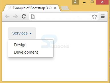
Carets icon in Bootstrap will have menus placed in drop-down box. When clicked on the caret icon, it displays the drop-down list.
[html]
<!DOCTYPE html>
<html lang="en">
<head>
<meta charset="UTF-8">
<title>Example of Bootstrap 3 Caret Icon</title>
<link rel="stylesheet" href="https://maxcdn.bootstrapcdn.com/bootstrap/3.3.6/css/bootstrap.min.css">
<link rel="stylesheet" href="https://maxcdn.bootstrapcdn.com/bootstrap/3.3.6/css/bootstrap-theme.min.css">
<script src="https://ajax.googleapis.com/ajax/libs/jquery/1.11.3/jquery.min.js"></script>
<script src="https://maxcdn.bootstrapcdn.com/bootstrap/3.3.6/js/bootstrap.min.js"></script>
<style type="text/css">
.bs-example{
margin: 20px;
}
</style>
</head>
<body>
<div class="bs-example">
<ul class="nav nav-pills">
<li class="dropdown">
<a href="#" data-toggle="dropdown" class="dropdown-toggle">Services <span class="caret"></span></a>
<ul class="dropdown-menu">
<li><a href="#">Design</a></li>
<li><a href="#">Development</a></li>
</ul>
</li>
</ul>
</div>
</body>
</html>
[/html]
Output:
Description
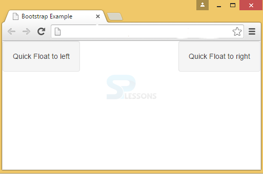
The elements in Bootstrap can be brought to left and right using floating classes like .pull-right and .pull-left. The following example explains the function of these classes:
[html]
<!DOCTYPE html>
<html lang="en">
<head>
<title>Bootstrap Example</title>
<meta charset="utf-8">
<meta name="viewport" content="width=device-width, initial-scale=1">
<link rel="stylesheet" href="http://maxcdn.bootstrapcdn.com/bootstrap/3.3.6/css/bootstrap.min.css">
<script src="https://ajax.googleapis.com/ajax/libs/jquery/1.12.0/jquery.min.js"></script>
<script src="http://maxcdn.bootstrapcdn.com/bootstrap/3.3.6/js/bootstrap.min.js"></script>
</head>
<body>
<div class="pull-left well">Quick Float to left</div>
<div class="pull-right well">Quick Float to right</div>
</body>
</html>
[/html]
Output:
Description
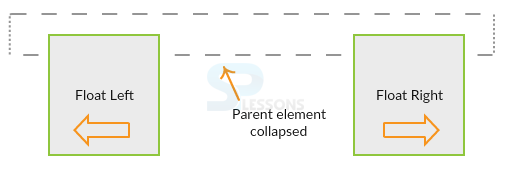
Before knowing about clear fix, one should have an idea about collapsing parent.
When working with layouts that floats, the collapsing parent appears which won’t get stretched automatically to acquire the floated elements. This condition is fine if visual backgrounds are not noticeable. The below figure shows the example of collapsing parent:
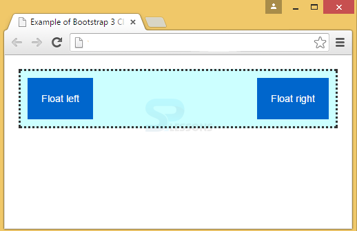
 To know about these strange layouts, clear fix can be used. Clear fix uses .clearfix class to clear the float on any element. In the below example, when the clear fix is applied to pull right and left elements, the layout i.e. collapsing parent does not coincide with elements instead it wraps them into the layout.
[html]
<!DOCTYPE html>
<html lang="en">
<head>
<meta charset="UTF-8">
<title>Example of Bootstrap 3 Clearfix</title>
<link rel="stylesheet" href="https://maxcdn.bootstrapcdn.com/bootstrap/3.3.6/css/bootstrap.min.css">
<link rel="stylesheet" href="https://maxcdn.bootstrapcdn.com/bootstrap/3.3.6/css/bootstrap-theme.min.css">
<script src="https://ajax.googleapis.com/ajax/libs/jquery/1.11.3/jquery.min.js"></script>
<script src="https://maxcdn.bootstrapcdn.com/bootstrap/3.3.6/js/bootstrap.min.js"></script>
<style type="text/css">
.wrapper{
margin: 20px;
padding: 10px;
background: #CCFFFF;
border: 1px solid #000;
border: dotted
}
.pull-left, .pull-right{
padding: 20px;
background: #0066CC;
color:#FFFFFF;
}
</style>
</head>
<body>
<!--Applying clear-fix to pull right and left classes-->
<div class="wrapper clearfix">
<div class="pull-left">Float left</div>
<div class="pull-right">Float right</div>
</div>
</body>
</html>
[/html]
Output:
To know about these strange layouts, clear fix can be used. Clear fix uses .clearfix class to clear the float on any element. In the below example, when the clear fix is applied to pull right and left elements, the layout i.e. collapsing parent does not coincide with elements instead it wraps them into the layout.
[html]
<!DOCTYPE html>
<html lang="en">
<head>
<meta charset="UTF-8">
<title>Example of Bootstrap 3 Clearfix</title>
<link rel="stylesheet" href="https://maxcdn.bootstrapcdn.com/bootstrap/3.3.6/css/bootstrap.min.css">
<link rel="stylesheet" href="https://maxcdn.bootstrapcdn.com/bootstrap/3.3.6/css/bootstrap-theme.min.css">
<script src="https://ajax.googleapis.com/ajax/libs/jquery/1.11.3/jquery.min.js"></script>
<script src="https://maxcdn.bootstrapcdn.com/bootstrap/3.3.6/js/bootstrap.min.js"></script>
<style type="text/css">
.wrapper{
margin: 20px;
padding: 10px;
background: #CCFFFF;
border: 1px solid #000;
border: dotted
}
.pull-left, .pull-right{
padding: 20px;
background: #0066CC;
color:#FFFFFF;
}
</style>
</head>
<body>
<!--Applying clear-fix to pull right and left classes-->
<div class="wrapper clearfix">
<div class="pull-left">Float left</div>
<div class="pull-right">Float right</div>
</div>
</body>
</html>
[/html]
Output:
Description
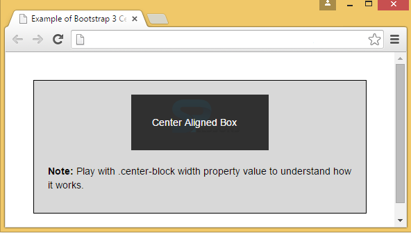
To align the block of content exactly in the center horizontally, the Bootstrap class .center-block is used.
The block can be given a desired width such that it is less than the parent element container.
[html]
<html lang="en">
<head>
<meta charset="UTF-8">
<title>Example of Bootstrap 3 Center Alignment</title>
<link rel="stylesheet" href="https://maxcdn.bootstrapcdn.com/bootstrap/3.3.6/css/bootstrap.min.css">
<link rel="stylesheet" href="https://maxcdn.bootstrapcdn.com/bootstrap/3.3.6/css/bootstrap-theme.min.css">
<script src="https://ajax.googleapis.com/ajax/libs/jquery/1.11.3/jquery.min.js"></script>
<script src="https://maxcdn.bootstrapcdn.com/bootstrap/3.3.6/js/bootstrap.min.js"></script>
<style type="text/css">
.wrapper{
margin: 40px;
padding: 20px;
background: #D8D8D8 ;
border: 1px solid #000;
color: #000000
}
.center-block{
width: 45%;
padding: 30px;
background: #303030;
color:#FFFFFF
}
</style>
</head>
<body>
<div class="wrapper">
<div class="center-block">Center Aligned Box</div>
<p><br><strong>Note:</strong> Play with .center-block width property value to understand how it works.</p>
</div>
</body>
</html>
[/html]
Output:
Description
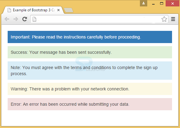
To apply background colors to elements, Contextual Background Color classes are used. These background colors are designated as .bg-emphasis_element_name
Below is an example for Contextual Backgrounds that allows the background to emphasis primary, info, success, and danger elements.
[html]
<!DOCTYPE html>
<html lang="en">
<head>
<meta charset="UTF-8">
<title>Example of Bootstrap 3 Contextual Background Classes</title>
<link rel="stylesheet" href="https://maxcdn.bootstrapcdn.com/bootstrap/3.3.6/css/bootstrap.min.css">
<link rel="stylesheet" href="https://maxcdn.bootstrapcdn.com/bootstrap/3.3.6/css/bootstrap-theme.min.css">
<script src="https://ajax.googleapis.com/ajax/libs/jquery/1.11.3/jquery.min.js"></script>
<script src="https://maxcdn.bootstrapcdn.com/bootstrap/3.3.6/js/bootstrap.min.js"></script>
<style type="text/css">
.bs-example{
margin: 20px;
}
.bs-example p{
padding: 10px;
}
</style>
</head>
<body>
<div class="bs-example">
<p class="bg-primary">Important: Please read the instructions carefully before proceeding.</p>
<p class="bg-success">Success: Your message has been sent successfully.</p>
<p class="bg-info">Note: You must agree with the terms and conditions to complete the sign up process.</p>
<p class="bg-warning">Warning: There was a problem with your network connection.</p>
<p class="bg-danger">Error: An error has been occurred while submitting your data.</p>
</div>
</body>
</html>
[/html]
Output:
Description
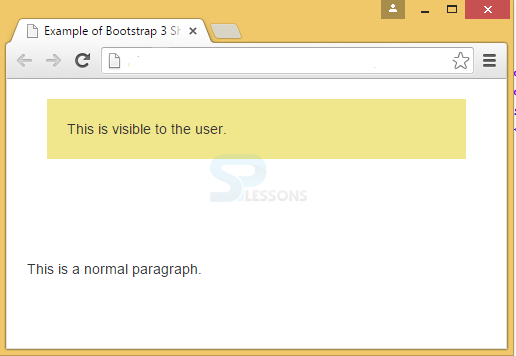
An element can be hidden or shown using .hidden and .show classes respectively. This is applicable to all devices. CSS is included while using these classes to avoid conflict in specifications like quick floats.
The class .invisible is used to toggle only element visibility, but the element occupies layout space. Below example shows how to show/hide the content:
[html]
<!DOCTYPE html>
<html lang="en">
<head>
<meta charset="UTF-8">
<title>Example of Bootstrap 3 Show Hide Content</title>
<link rel="stylesheet" href="https://maxcdn.bootstrapcdn.com/bootstrap/3.3.6/css/bootstrap.min.css">
<link rel="stylesheet" href="https://maxcdn.bootstrapcdn.com/bootstrap/3.3.6/css/bootstrap-theme.min.css">
<script src="https://ajax.googleapis.com/ajax/libs/jquery/1.11.3/jquery.min.js"></script>
<script src="https://maxcdn.bootstrapcdn.com/bootstrap/3.3.6/js/bootstrap.min.js"></script>
<style type="text/css">
.bs-example{
margin: 20px;
}
.bs-example div{
margin: 20px;
padding: 20px;
background: #f0e68c;
}
div.hint{
display: none;
}
</style>
</head>
<body>
<div class="bs-example">
<div class="hint show">This is visible to the user.</div>
<div class="hidden">This is not visible to the user.</div>
<div class="invisible">This is not visible to the user but affects the layout.</div>
<p>This is a normal paragraph.</p>
</div>
</body>
</html>
[/html]
Output:
Description
To hide an element to all devices except screen readers, .sr-only class is used.
Below example shows the output, as screen is used here and not the mobile or any other device.
[html]
<!DOCTYPE html>
<html lang="en">
<head>
<meta charset="UTF-8">
<title>Example of Bootstrap 3 Screen Reader Content</title>
<link rel="stylesheet" href="https://maxcdn.bootstrapcdn.com/bootstrap/3.3.6/css/bootstrap.min.css">
<link rel="stylesheet" href="https://maxcdn.bootstrapcdn.com/bootstrap/3.3.6/css/bootstrap-theme.min.css">
<script src="https://ajax.googleapis.com/ajax/libs/jquery/1.11.3/jquery.min.js"></script>
<script src="https://maxcdn.bootstrapcdn.com/bootstrap/3.3.6/js/bootstrap.min.js"></script>
<style type="text/css">
.bs-example{
margin: 20px;
}
</style>
</head>
<body>
<div class="bs-example">
<p>This paragraph is visible to all devices.</p>
<p class="sr-only">This paragraph is only visible to screen readers.</p>
</div>
</body>
</html>
[/html]
The below output is not seen if opened in mobile devices.
Output: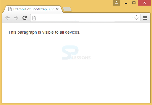
Key Points
Bootstrap Helpers draws out following main points.
- Close icon releases alerts.
- Dropdown icon uses caret icon.
- Elements float is possible by pull-right and pull-left classes.
- Clearfix clears the float.
- center-block class aligns blocks to the center.
- Screen reader makes the content visible only to screen readers.