


 Introduction
This chapter demonstrates about the SVG CSS which is used to style the element. User can also use animations and transforms to manipulate the elements. Following are the concepts covered in this chapter.
- Animating SVG with CSS
- Animating SVG with SMIL
Description
SVG styled with CSS is know as SVG CSS which means user can also use CSS animation and transforms to manipulate those elements like as HTML element. In order to make the style user need to add some key frame animations to change the color and CSS animations should only be used for more simple animations i.e which are limited to only the properties of CSS provided. The below table demonstrated some SVG CSS properties and description.
The code below demonstrates the SVG with CSS by using the above properties.
[html]
<html>
<head>
<style>
svg {
background-color: beige;
}
#heading {
font-size: 24px;
font-weight: bold;
}
#caption {
font-size: 12px;
}
/* flower */
#flower:hover {
cursor: crosshair;
}
/* gradient */
#fade-stop-1 {
stop-color:darkgreen;
}
#fade-stop-2 {
stop-color: white;
}
/* outer petals */
#outer-petals {
opacity: .75;
}
#outer-petals .segment-fill {
fill: azure;
stroke: lightsteelblue;
stroke-width: 1;
}
#outer-petals .segment-edge {
fill: none;
stroke: blue;
stroke-width: 3;
}
#outer-petals .segment:hover > .segment-fill {
fill: plum;
stroke: none;
}
#outer-petals .segment:hover > .segment-edge {
stroke: blue;
}
/* inner petals */
#inner-petals .segment-fill {
fill: orange;
stroke: red;
stroke-width: 1;
}
#inner-petals .segment-edge {
fill: none;
stroke: blue;
stroke-width: 9;
}
#inner-petals .segment:hover > .segment-fill {
fill: darkseagreen;
stroke: none;
}
#inner-petals .segment:hover > .segment-edge {
stroke: green;
}
</style>
</head>
<body>
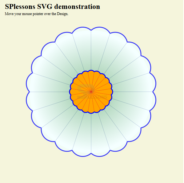
<svg width="600px" height="600px" viewBox="-300 -300 600 600"
<title>SPLessons SVG demonstration</title>
<desc>Mozilla CSS Getting Started - SPLessons SVG demonstration</desc>
<defs>
<g id="segment" class="segment">
<path class="segment-fill" d="M0,0 v-200 a40,40 0 0,0 -62,10 z"/>
<path class="segment-edge" d="M0,-200 a40,40 0 0,0 -62,10"/>
</g>
<g id="quadrant">
<use xlink:href="#segment"/>
<use xlink:href="#segment" transform="rotate(18)"/>
<use xlink:href="#segment" transform="rotate(36)"/>
<use xlink:href="#segment" transform="rotate(54)"/>
<use xlink:href="#segment" transform="rotate(72)"/>
</g>
<g id="petals">
<use xlink:href="#quadrant"/>
<use xlink:href="#quadrant" transform="rotate(90)"/>
<use xlink:href="#quadrant" transform="rotate(180)"/>
<use xlink:href="#quadrant" transform="rotate(270)"/>
</g>
<radialGradient id="fade" cx="0" cy="0" r="200"
gradientUnits="userSpaceOnUse">
<stop id="fade-stop-1" offset="33%"/>
<stop id="fade-stop-2" offset="95%"/>
</radialGradient>
</defs>
<text id="heading" x="-280" y="-270">
SPlessons SVG demonstration</text>
<text id="caption" x="-280" y="-250">
Move your mouse pointer over the Design.</text>
<g id="flower">
<circle id="overlay" cx="0" cy="0" r="200"
stroke="none" fill="url(#fade)"/>
<use id="outer-petals" xlink:href="#petals"/>
<use id="inner-petals" xlink:href="#petals"
transform="rotate(9) scale(0.33)"/>
</g>
</svg>
</body>
</html>
[/html]
Result
By running the above code in a preferred browser then user will get the output as shown below.
| Property | Description |
|---|---|
| fill | Used to fill color of the shape. |
| fill-rule | Used to set the fill rule of the shape. |
| fill-opacity | Used to set the fill opacity of the shape. |
| marker | Used to mark the lines along the shapes. |
| marker-start | Start marker along the lines of the shape. |
| marker-mid | mid marker along the lines of the shape. |
| marker-end | end marker along the lines of the shape. |
| text-rendering | Used to draw the outline of the shape. |
| stroke | Used to draw the outline color of the shape. |
| stroke-opacity | Used to draw outline of the shape. |
Description
Graphics are defined by the animation elements which are initially defined in the SMIL. SMIL is known as the Synchronised Multimedia Integration Language is the markup language is used to animate the SVGs without using the CSS by using CSS user can do the more complex animations. Following are the elements are included in SMIL.
- Animate
- Animate Motion
- Animate Transform
- Set
Description
The Animate element is used to animate a single attribute or property of another element. The code below demonstrates the Animate from starting point to the ending point element as shown.
[html]
<!DOCTYPE html>
<html>
<head>
<meta charset="UTF-8">
<title>SVG Animations</title>
</head>
<body>
<svg width="300" height="200">
<rect x="0" y="0" width="300" height="200">
<animate attributeName="x" from="-300" to="300" dur="5s" repeatCount="indefinite"/>
</rect>
</svg>
</body>
</html>
[/html]
Result
By running the above code in a preferred browser then user will get the output as shown below.
Description
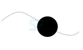
AnimateMotion Element uses the path data from a given path element to create a motion path for an object to move along the path. The code below demonstrates the moving the circle along the path as shown.
[html]
<!DOCTYPE html>
<html>
<head>
<meta charset="UTF-8">
<title>SVG Animations</title>
</head>
<body>
<svg width="300" height="200">
<!-- Motion Path-->
<path id="motionPath"
d="M-141.333,218C-60,138.667,20,39.333,74.667,45.333s244.667,200,244,.667,200"
stroke="#ccc" stroke-width="3" fill="none"/>
<!--Animated path-->
<circle cx="" cy="" r="40">
<animateMotion dur="3s" repeatCount="indefinite">
<mpath xlink:href="#motionPath"/>
</animateMotion>
</circle>
</svg>
</body>
</html>
[/html]
Result
By running the above code in a preferred browser then user will get the output as shown below.
Description
The animateTransform element animates the translation, scaling, rotation, or skewing of the another element. The code below demonstrates the transforming the rectangle.
[html]
<!DOCTYPE html>
<html>
<head>
<meta charset="UTF-8">
<title>SVG Animations</title>
</head>
<body>
<svg width="300" height="200">
<rect x="75" y="75" width="100" height="100">
<animateTransform attributeName="transform"
type="rotate"
from="0 150 150"
to="360 150 150"
dur="5s"
repeatCount="indefinite"/>
</rect>
</svg>
</body>
</html>
[/html]
Result
By running the above code in a preferred browser then user will get the output as shown below.
Description
Set element is used to set a value for the attribute to animate to over a duration of time. The code below demonstrates to set the value to the attribute as shown below.
[html]
<!DOCTYPE html>
<html>
<head>
<meta charset="UTF-8">
<title>SVG Animations</title>
</head>
<body>
<svg width="300" height="300">
<circle cx="150" cy="150" r="10">
<set attributeName="r"
to="100"
begin="3s"
fill="freeze"
</circle>
</svg>
</body>
</html>
[/html]
Result
By running the above code in a preferred browser then user will get the output as shown below.
Key Points
- The elements of SVG styled by CSS is know as SVG CSS.
- Key frames animations are used to change the styles of SVGs.
- SMIL are used to style the SVG Without CSS.