


 Introduction
This chapter demonstrates about the SVG Filters which is defined by the
<defs> element. Filters are referenced by the graphic elements by using their ID's following are the concepts covered in this chapter.
- Filter Elements
- Browser Supports
- SVG Effects
Description
SVG Filters are defined by their ID's and which are defined with in
<def> elements. SVG have several types of filters following are some mostly and commonly used filters listed below.
- feColorMatrix
- feBlend
- feComposite
- feConvolveMatrix
- feComponenetTransfer
- feDiffuseLighting
- feFlood
- feDisplacementMap
- feGaussianBlur
- feMerge
- feImage
- feOffset
- femorphology
- feTile
- feSpecularLighting
- feTurbulence
- feDistantLight
- feSpotLight
- fePointLight
Description
SVG Filters are supported by all the latest browsers, following are the browser versions supported by SVG Filters.
- Chrome 8.0
- Internet Explorer 10.0
- Mozilla Firefox 3.0
- Safari 6.0
- Opera 9.6
Description
SVG effects are mainly defined as two types those are the Blur Effects and Shadow Effects Which are defined in  Drop Shadows
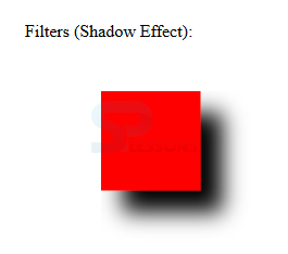
In order to create the drop shadows user need to use the
Drop Shadows
In order to create the drop shadows user need to use the 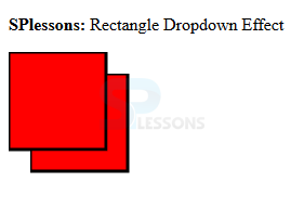 The code below demonstrates the filters with the shadow effect as shown below.
[html]
<html>
<title>SVG ShadowEffect</title>
<body>
<svg width="800" height="800">
<defs>
<filter id="filter1" x="0" y="0">
<feGaussianBlur in="SourceGraphic" stdDeviation="8" />
</filter>
<filter id="filter2" x="0" y="0" width="200%" height="200%">
<feOffset result="offOut" in="SourceAlpha" dx="20" dy="20" />
<feGaussianBlur result="blurOut" in="offOut" stdDeviation="10" />
<feBlend in="SourceGraphic" in2="blurOut" mode="normal" />
</filter>
</defs>
<g>
<text x="30" y="50" >Filters (Shadow Effect): </text>
<rect x="100" y="100" width="90" height="90" stroke="red" stroke-width="3"
fill="red" filter="url(#filter2)" />
</g>
</svg>
</body>
</html>
[/html]
Result
By running the above code in a preferred browser then user will get the output as shown below.
The code below demonstrates the filters with the shadow effect as shown below.
[html]
<html>
<title>SVG ShadowEffect</title>
<body>
<svg width="800" height="800">
<defs>
<filter id="filter1" x="0" y="0">
<feGaussianBlur in="SourceGraphic" stdDeviation="8" />
</filter>
<filter id="filter2" x="0" y="0" width="200%" height="200%">
<feOffset result="offOut" in="SourceAlpha" dx="20" dy="20" />
<feGaussianBlur result="blurOut" in="offOut" stdDeviation="10" />
<feBlend in="SourceGraphic" in2="blurOut" mode="normal" />
</filter>
</defs>
<g>
<text x="30" y="50" >Filters (Shadow Effect): </text>
<rect x="100" y="100" width="90" height="90" stroke="red" stroke-width="3"
fill="red" filter="url(#filter2)" />
</g>
</svg>
</body>
</html>
[/html]
Result
By running the above code in a preferred browser then user will get the output as shown below.
<defs> elements. The elements which are defined in <defs> those are treated as a special elements like filters.
Blur Effects
Blur Effect is defined with the <feGaussianBlur> element. To blur some part of the image user need to use the stdDeviation attribute. The <rect> element links the element to the "f1" filter. The code below demonstrates the SVG Blur.
[html]
<!DOCTYPE html>
<html>
<body>
<p><strong>SPLessons:</strong> SVG Blur Effects.</p>
<svg height="110" width="110">
<defs>
<filter id="f1" x="0" y="0">
<feGaussianBlur in="SourceGraphic" stdDeviation="15" />
</filter>
</defs>
<rect width="90" height="90" stroke="green" stroke-width="3" fill="red" filter="url(#f1)" />
</svg>
</body>
</html>
[/html]
Result
By running the above code in a preferred browser then user will get the output as shown below.
<feOffset> element which can be used to move image little bit in the same plain. The code below demonstrates the offset rectangle i.e drop shadows effect.
[html]
<!DOCTYPE html>
<html>
<body>
<p><strong>SPlessons:</strong> Rectangle Dropdown Effect</p>
<svg height="120" width="120">
<defs>
<filter id="f1" x="0" y="0" width="200%" height="200%">
<feOffset result="offOut" in="SourceGraphic" dx="20" dy="20" />
<feBlend in="SourceGraphic" in2="offOut" mode="normal" />
</filter>
</defs>
<rect width="90" height="90" stroke="black" stroke-width="3" fill="red" filter="url(#f1)" />
</svg>
</body>
</html>
[/html]
Result
By running the above code in a preferred browser then user will get the output as shown below.
Key Points
- Filters have the unique ID Attributes.
- Filters are referenced by graphic elements by their IDs.
- If multiple filter elements are present can be defined as filter 1 and filter 2.