


 Introduction
This chapter demonstrates about the SVG masks which is used to apply the masks on SVG shapes. By using the SVG shapes user can determine the visible shapes of the svg shapes following are the concepts covered in this chapter.
- SVG Masks
- Mask examples
Description
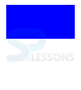
SVG masks is known as the more advanced versions of a clip path. SVG masks defines only visible part of the SVG. User can apply SVG mask to any basic SVG shape the code below demonstrates the basic SVG mask as shown below.
[html]
<svg>
<defs>
<mask id="mask1" x="0" y="0" width="100" height="100" >
<rect x="0" y="0" width="100" height="50"
style="stroke:none; fill: #ffffff"/>
</mask>
</defs>
<rect x="1" y="1" width="100" height="100"
style="stroke: none; fill: #0000ff; mask: url(#mask1)"/>
</svg>
[/html]
Result
By running the above code in a preferred browser then user will get the output as shown below.
Description
The example code below demonstrate the mask for basic SVG shapes.
[html]
<svg>
<defs>
<mask id="mask2" x="0" y="0" width="100" height="100" >
<circle cx="25" cy="25" r="25" style="stroke:none; fill: #ffffff"/>
</mask>
</defs>
<rect x="1" y="1" width="100" height="100"
style="stroke: none; fill: #0000ff; mask: url(#mask2)"/>
</svg>
[/html]
Result
By running the above code in a preferred browser then user will get the output is as shown below.
 Masking
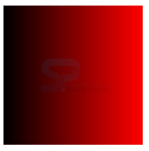
In masking Gradient masking is most effective. If user need to fade out the element user can do the mask by using masks the code below demonstrates mask the gradient as shown.
[html]
<svg width="200" height="200" version="1.1" >
<defs>
<linearGradient id="Gradient">
<stop offset="0" stop-color="white" stop-opacity="0" />
<stop offset="1" stop-color="white" stop-opacity="1" />
</linearGradient>
<mask id="Mask">
<rect x="0" y="0" width="200" height="200" fill="url(#Gradient)" />
</mask>
</defs>
<rect x="0" y="0" width="200" height="200" fill="black" />
<rect x="0" y="0" width="200" height="200" fill="red" mask="url(#Mask)" />
</svg>
[/html]
Result
By running the above code in a preferred browser then user will get the output as shown below.
Masking
In masking Gradient masking is most effective. If user need to fade out the element user can do the mask by using masks the code below demonstrates mask the gradient as shown.
[html]
<svg width="200" height="200" version="1.1" >
<defs>
<linearGradient id="Gradient">
<stop offset="0" stop-color="white" stop-opacity="0" />
<stop offset="1" stop-color="white" stop-opacity="1" />
</linearGradient>
<mask id="Mask">
<rect x="0" y="0" width="200" height="200" fill="url(#Gradient)" />
</mask>
</defs>
<rect x="0" y="0" width="200" height="200" fill="black" />
<rect x="0" y="0" width="200" height="200" fill="red" mask="url(#Mask)" />
</svg>
[/html]
Result
By running the above code in a preferred browser then user will get the output as shown below.
 Transparency Opacity
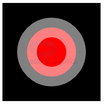
The snippet below demonstrates to set the transperncy for the whole element by using the opacity attribute.
[html]
<rect x="0" y="0" width="100" height="100" opacity=".5" />
[/html]
In order to fill and stroke the above triangle there are two separate attributes which are the fill-opacity and stroke-opacity. If user used the stroke opacity on an element then which will shine through half of the stroke and other half the background will appear the code as shown below.
[html]
<svg width="200" height="200" version="1.1" >
<rect x="0" y="0" width="200" height="200" fill="black" />
<circle cx="100" cy="100" r="50" stroke="white" stroke-width="40" stroke-opacity=".5" fill="red" />
</svg>
[/html]
Result
By running the above code in a preferred browser then user will get the output as shown below.
Transparency Opacity
The snippet below demonstrates to set the transperncy for the whole element by using the opacity attribute.
[html]
<rect x="0" y="0" width="100" height="100" opacity=".5" />
[/html]
In order to fill and stroke the above triangle there are two separate attributes which are the fill-opacity and stroke-opacity. If user used the stroke opacity on an element then which will shine through half of the stroke and other half the background will appear the code as shown below.
[html]
<svg width="200" height="200" version="1.1" >
<rect x="0" y="0" width="200" height="200" fill="black" />
<circle cx="100" cy="100" r="50" stroke="white" stroke-width="40" stroke-opacity=".5" fill="red" />
</svg>
[/html]
Result
By running the above code in a preferred browser then user will get the output as shown below.
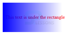
 Gradient Mask
User can apply the gradient shape as a mask and can get the gradient transparency to the shape the code below demonstrates the gradient mask which contains the text under rectangle. User can observe the transparency get changes with the gradient of the mask as shown below.
[html]
<svg>
<defs>
<linearGradient id="gradient1"
x1="0%" y1="0%"
x2="100%" y2="0%"
spreadMethod="pad">
<stop offset="0%" stop-color="#ffffff" stop-opacity="1"/>
<stop offset="100%" stop-color="#000000" stop-opacity="1"/>
</linearGradient>
<mask id="mask4" x="0" y="0" width="200" height="100" >
<rect x="0" y="0" width="200" height="100"
style="stroke:none; fill: url(#gradient1)"/>
</mask>
</defs>
<text x="10" y="55" style="stroke: none; fill: #ff0000;">
This text is under the rectangle
</text>
<rect x="1" y="1" width="200" height="100"
style="stroke: none; fill: #0000ff; mask: url(#mask4)"/>
</svg>
[/html]
Result
By running the above code in a preferred browser then user will get the output as shown below.
Gradient Mask
User can apply the gradient shape as a mask and can get the gradient transparency to the shape the code below demonstrates the gradient mask which contains the text under rectangle. User can observe the transparency get changes with the gradient of the mask as shown below.
[html]
<svg>
<defs>
<linearGradient id="gradient1"
x1="0%" y1="0%"
x2="100%" y2="0%"
spreadMethod="pad">
<stop offset="0%" stop-color="#ffffff" stop-opacity="1"/>
<stop offset="100%" stop-color="#000000" stop-opacity="1"/>
</linearGradient>
<mask id="mask4" x="0" y="0" width="200" height="100" >
<rect x="0" y="0" width="200" height="100"
style="stroke:none; fill: url(#gradient1)"/>
</mask>
</defs>
<text x="10" y="55" style="stroke: none; fill: #ff0000;">
This text is under the rectangle
</text>
<rect x="1" y="1" width="200" height="100"
style="stroke: none; fill: #0000ff; mask: url(#mask4)"/>
</svg>
[/html]
Result
By running the above code in a preferred browser then user will get the output as shown below.
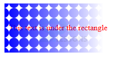
 Fill patterns in Masks
User can also use the fill patterns in SVG Mask and shape the mask to the fill pattern as shown in below code.
[html]
<svg>
<defs>
<linearGradient id="gradient2"
x1="0%" y1="0%"
x2="100%" y2="0%"
spreadMethod="pad">
<stop offset="0%" stop-color="#ffffff" stop-opacity="1"/>
<stop offset="100%" stop-color="#000000" stop-opacity="1"/>
</linearGradient>
<pattern id="pattern2"
x="10" y="10" width="20" height="20"
patternUnits="userSpaceOnUse" >
<circle cx="10" cy="10" r="10" style="stroke: none; fill: #0000ff; " />
</pattern>
<mask id="mask6" x="0" y="0" width="200" height="100" >
<rect x="0" y="0" width="200" height="100"
style="stroke:none; fill: url(#gradient2)"/>
</mask>
</defs>
<text x="10" y="55" style="stroke: none; fill: #ff0000;">
This text is under the rectangle
</text>
<rect x="1" y="1" width="200" height="100"
style="stroke: none; fill: url(#pattern2); mask: url(#mask6)"/>
</svg>
[/html]
Result
By running the above code in a preferred browser then user will get the output as shown below.
Fill patterns in Masks
User can also use the fill patterns in SVG Mask and shape the mask to the fill pattern as shown in below code.
[html]
<svg>
<defs>
<linearGradient id="gradient2"
x1="0%" y1="0%"
x2="100%" y2="0%"
spreadMethod="pad">
<stop offset="0%" stop-color="#ffffff" stop-opacity="1"/>
<stop offset="100%" stop-color="#000000" stop-opacity="1"/>
</linearGradient>
<pattern id="pattern2"
x="10" y="10" width="20" height="20"
patternUnits="userSpaceOnUse" >
<circle cx="10" cy="10" r="10" style="stroke: none; fill: #0000ff; " />
</pattern>
<mask id="mask6" x="0" y="0" width="200" height="100" >
<rect x="0" y="0" width="200" height="100"
style="stroke:none; fill: url(#gradient2)"/>
</mask>
</defs>
<text x="10" y="55" style="stroke: none; fill: #ff0000;">
This text is under the rectangle
</text>
<rect x="1" y="1" width="200" height="100"
style="stroke: none; fill: url(#pattern2); mask: url(#mask6)"/>
</svg>
[/html]
Result
By running the above code in a preferred browser then user will get the output as shown below.
Key Points
- Masking allows soft edges by taking transperncy and grey values.
- Mask define the visible part of the SVG.
- SVG mask supported by all the browsers.