


 Description
Description
Once the bootstrap file is downloaded, unzip and save the folder in the local system.
Then, create the project file structure similar to the below structure and place the downloaded bootstrap files in associated folders.
[html]
firstbootstrappage/
├── css/
│ ├── bootstrap.css
| ├── bootstrap.min.css
│ └── customstyles.css
├── js/
│ ├── bootstrap.js
| ├── bootstrap.min.js
│ └── jQuery.js
└── index.html
[/html]
Description
Every bootstrap web page must have the follow code structure:
- Page must have HTML5 doctype
- Meta viewport tag
- Container
lang attribute and correct character set.
The code is set in the following structure implies that the browser is told to please render the page with HTML 5 compatible mode. So that bootstrap page will render properly in browser and gives expected output.
[html]
<!Doctype html>
<html lang="en">
<head>
<meta charset="utf-8">
</head>
<body>
</body>
</html>
[/html]
As known, Bootstrap 3.0 is mobile first technology.
Before starting actual body content, tell to the browser to set proper view port of rendering device.
[html]
<meta name="viewport" content="width=device-width, initial-scale=1">
[/html]
width=device-width: With this attribute, the browser will set the width of webpage to the width of device.
initial-scale=1: With this attribute, the browser will set initial zoom level when the page is first loaded.
Normally, the body content is placed in between html body tag but if bootstrap is used, there are two special classes to wrap the content, they are .container and .container-fluid
.container: It will add the responsive feature to the website with fixed width and keeps the content in middle of the browser..container-fluid: It will provide the fluid width and utilizes the entire browser's width. In the next chapters, detailed difference between the two classes will be discussed.
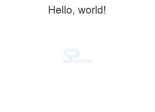
Example - 1
[html]
<!DOCTYPE html>
<html lang="en">
<head>
<meta charset="utf-8">
<meta http-equiv="X-UA-Compatible" content="IE=edge">
<meta name="viewport" content="width=device-width, initial-scale=1">
<!-- The above 3 meta tags *must* come first in the head; any other head content must come *after* these tags -->
<title>SPLessons - Bootstrp first Examples</title>
<!-- Bootstrap -->
<link href="css/bootstrap.min.css" rel="stylesheet">
</head>
<body>
<div class="container">
<h1 class="text-center">Hello, world!</h1>
</div> <!-- /.container -->
<!-- jQuery (necessary for Bootstrap's JavaScript plugins) -->
<script src="https://ajax.googleapis.com/ajax/libs/jquery/1.11.2/jquery.min.js"></script>
<!-- Include all compiled plugins (below), or include individual files as needed -->
<script src="js/bootstrap.min.js"></script>
</body>
</html><!DOCTYPE html>
<html lang="en">
<head>
<meta charset="utf-8">
<meta http-equiv="X-UA-Compatible" content="IE=edge">
<meta name="viewport" content="width=device-width, initial-scale=1">
<!-- The above 3 meta tags *must* come first in the head; any other head content must come *after* these tags -->
<title>SPLessons - Bootstrp first Examples</title>
<!-- Bootstrap -->
<link href="css/bootstrap.min.css" rel="stylesheet">
</head>
<body>
<div class="container">
<h1 class="text-center">Hello, world!</h1>
</div> <!-- /.container -->
<!-- jQuery (necessary for Bootstrap's JavaScript plugins) -->
<script src="https://ajax.googleapis.com/ajax/libs/jquery/1.11.2/jquery.min.js"></script>
<!-- Include all compiled plugins (below), or include individual files as needed -->
<script src="js/bootstrap.min.js"></script>
</body>
</html>
[/html]
Output:
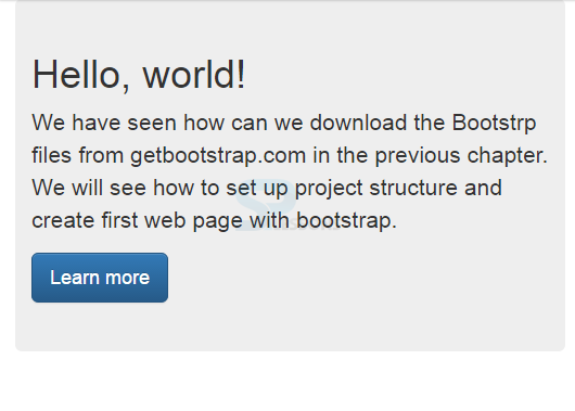
Example - 2
[html]
<!DOCTYPE html>
<html lang="en">
<head>
<meta charset="utf-8">
<meta http-equiv="X-UA-Compatible" content="IE=edge">
<meta name="viewport" content="width=device-width, initial-scale=1">
<!-- The above 3 meta tags *must* come first in the head; any other head content must come *after* these tags -->
<title>SPLessons - Bootstrp first Examples</title>
<!-- Bootstrap -->
<link href="css/bootstrap.min.css" rel="stylesheet">
</head>
<body>
<div class="container">
<div class="jumbotron">
<h1>Hello, world!</h1>
<p>We have seen how can we download the Bootstrp files from getbootstrap.com in the previous chapter.
We will see how to set up project structure and create first web page with bootstrap.</p>
<p><a class="btn btn-primary btn-lg" href="http://www.splessons.com/lesson/bootstrap-3-tutorial" role="button">Learn more</a></p>
</div>
</div> <!-- /.container -->
<!-- jQuery (necessary for Bootstrap's JavaScript plugins) -->
<script src="https://ajax.googleapis.com/ajax/libs/jquery/1.11.2/jquery.min.js"></script>
<!-- Include all compiled plugins (below), or include individual files as needed -->
<script src="js/bootstrap.min.js"></script>
</body>
</html>
[/html]
Output:
Key Points
- Every webpage must start with HTML5 doctype along with the lang attribute and correct character set.
- Viewport sets the width.
- Container class is used to wrap the content in Bootstrap.