


 Description
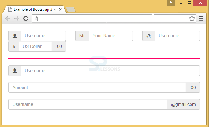
Bootstrap features Input Groups that are mostly used in Forms. With Input group, elements can be appended or prepended using a class .input-group with an addon called .input-group-addon in a .form-control. The addon can be inserted on a single side or both sides of the input. Steps to be followed while adding Bootstrap Input Group are as follows:
- Initially, create a form class.
- Now, wrap the Input Group elements under class input-group within <div>.
- Next, under the <div> class place the addon with input-group-addon notation in a span class.
- Then, place the <span> after/before the <input> element.
- As input group is totally a separate component, never apply directly to form groups.
Example
[html]
<!DOCTYPE html>
<html lang="en">
<head>
<meta charset="UTF-8">
<title>Example of Bootstrap 3 Prepended and Appended Inputs</title>
<link rel="stylesheet" href="https://maxcdn.bootstrapcdn.com/bootstrap/3.3.6/css/bootstrap.min.css">
<link rel="stylesheet" href="https://maxcdn.bootstrapcdn.com/bootstrap/3.3.6/css/bootstrap-theme.min.css">
<script src="https://ajax.googleapis.com/ajax/libs/jquery/1.11.3/jquery.min.js"></script>
<script src="https://maxcdn.bootstrapcdn.com/bootstrap/3.3.6/js/bootstrap.min.js"></script>
<style type="text/css">
.bs-example{
margin: 20px;
}
hr {
width: 100%;
height: 4px;
margin-left: auto;
margin-right: auto;
background-color:#FF0066;
color:#FF0066;
border: 0 none;
}
</style>
</head>
<body>
<div class="bs-example">
<form>
<div class="row">
<div class="col-xs-4">
<div class="input-group">
<span class="input-group-addon"><span class="glyphicon glyphicon-user"></span></span><!-- Append element using class input-group-addon -->
<input type="text" class="form-control" placeholder="Username">
</div>
</div>
<div class="col-xs-4">
<div class="input-group">
<span class="input-group-addon">Mr</span> <!-- Append element using class input-group-addon -->
<input type="text" class="form-control" placeholder="Your Name">
</div>
</div>
<div class="col-xs-4">
<div class="input-group"> <!-- default sized input -->
<span class="input-group-addon">@</span>
<input type="text" class="form-control" placeholder="Username">
</div>
</div>
<div class="col-xs-4">
<div class="input-group">
<span class="input-group-addon">$</span><!-- Append element using class input-group-addon -->
<input type="text" class="form-control" placeholder="US Dollar">
<span class="input-group-addon">.00</span><!-- Prepend element using class input-group-addon -->
</div>
</div>
</div>
</form>
<hr>
<form>
<div class="input-group">
<span class="input-group-addon"><span class="glyphicon glyphicon-user"></span></span><!-- Append element using class input-group-addon -->
<input type="text" class="form-control" placeholder="Username">
</div>
<br>
<div class="input-group">
<input type="text" class="form-control" placeholder="Amount">
<span class="input-group-addon">.00</span><!-- Prepend element using class input-group-addon -->
</div>
<br>
<div class="input-group">
<input type="text" class="form-control" placeholder="Username">
<span class="input-group-addon">@gmail.com</span><!-- Prepend element using class input-group-addon -->
</div>
</form>
</div>
</body>
</html>
[/html]
Output:
Description
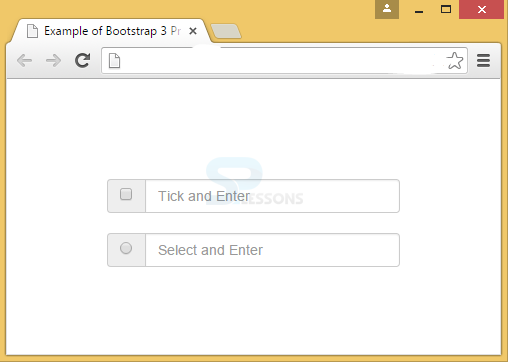
A text input group can be replaced with checkbox or radio button. For that, the .input-group-addon can be used.
Example
[html]
<!DOCTYPE html>
<html lang="en">
<head>
<meta charset="UTF-8">
<title>Example of Bootstrap 3 Prepended and Appended Inputs</title>
<link rel="stylesheet" href="https://maxcdn.bootstrapcdn.com/bootstrap/3.3.6/css/bootstrap.min.css">
<link rel="stylesheet" href="https://maxcdn.bootstrapcdn.com/bootstrap/3.3.6/css/bootstrap-theme.min.css">
<script src="https://ajax.googleapis.com/ajax/libs/jquery/1.11.3/jquery.min.js"></script>
<script src="https://maxcdn.bootstrapcdn.com/bootstrap/3.3.6/js/bootstrap.min.js"></script>
</head>
<body>
<div style = "padding: 100px 100px 10px;">
<form class = "bs-example bs-example-form" role = "form">
<div class = "row">
<div class = "col-lg-6">
<div class = "input-group">
<span class = "input-group-addon">
<input type = "checkbox">
</span>
<input type = "text" class = "form-control" placeholder="Tick and Enter">
</div><!-- End of input-group -->
</div><br>
<div class = "col-lg-6">
<div class = "input-group">
<span class = "input-group-addon">
<input type = "radio">
</span>
<input type = "text" class = "form-control" placeholder="Select and Enter">
</div><!-- End of input-group -->
</div>
</div><!-- End of row -->
</form>
</div>
</body>
</html>
[/html]
Output:
Description
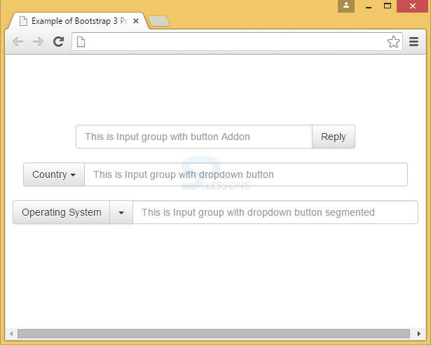
Buttons can be attached to Input groups in various ways.
Buttons in Bootstrap will require an extra level of nesting when inserted with input groups. So, instead of input-group-addon, input-group-btn is used to avoid overriding of default browser styles.
In input groups, buttons can be added by wrapping dropdown menu and button in .input-group-btn class.
A dropdown button can be created using .dropdown-toggle.
Example
Below example demonstrates all the above concepts and extended classes.
[html]
<!DOCTYPE html>
<html lang="en">
<head>
<meta charset="UTF-8">
<title>Example of Bootstrap 3 Prepended and Appended Inputs</title>
<link rel="stylesheet" href="https://maxcdn.bootstrapcdn.com/bootstrap/3.3.6/css/bootstrap.min.css">
<link rel="stylesheet" href="https://maxcdn.bootstrapcdn.com/bootstrap/3.3.6/css/bootstrap-theme.min.css">
<script src="https://ajax.googleapis.com/ajax/libs/jquery/1.11.3/jquery.min.js"></script>
<script src="https://maxcdn.bootstrapcdn.com/bootstrap/3.3.6/js/bootstrap.min.js"></script>
</head>
<body>
<div style = "padding: 100px 100px 10px;">
<div class="row">
<form class = "bs-example bs-example-form" role = "form">
<div class="col-lg-6">
<div class="input-group">
<input type="text" class="form-control" placeholder="This is Input group with button Addon">
<span class="input-group-btn"><!-- Append button addon using class input-group-lg -->
<button class="btn btn-default" type="button">Reply</button>
</span>
</div>
</div>
</form>
</div><!-- row -->
</div>
<div style = "padding: 10px 10px 10px;">
<form class = "bs-example bs-example-form" role = "form">
<div class="col-lg-6">
<div class="input-group">
<div class="input-group-btn">
<!-- Dropdown using class dropdown-toggle-->
<button type="button" class="btn btn-default dropdown-toggle" data-toggle="dropdown">Country
<span class="caret"></span>
</button>
<!-- dropdown list items -->
<ul class="dropdown-menu" role="menu">
<li><a href="#">USA</a></li>
<li><a href="#">Japan</a></li>
<li><a href="#">India</a></li>
<li class="divider"></li>
<li><a href="#">China</a></li>
</ul>
</div>
<input type="text" class="form-control" placeholder="This is Input group with dropdown button">
</div>
</div>
</form>
</div>
<div style = "padding: 10px 10px 10px;">
<div class="row">
<div class="col-lg-6">
<div class="input-group">
<div class="input-group-btn">
<button type="button" class="btn btn-default" tabindex="-1">Operating System</button>
<!-- Dropdown using dropdown-toggle class -->
<button type="button" class="btn btn-default dropdown-toggle" data-toggle="dropdown" tabindex="-1">
<span class="caret"></span><!-- caret -->
<span class="sr-only">Toggle Dropdown</span>
</button>
<!-- Dropdown list items -->
<ul class="dropdown-menu" role="menu">
<li><a href="#">Windows</a></li>
<li><a href="#">Max OS X</a></li>
<li><a href="#">Ubuntu</a></li>
<li class="divider"></li>
<li><a href="#">Fedora</a></li>
</ul>
</div>
<input type="text" class="form-control" placeholder="This is Input group with dropdown button segmented">
</div>
</div>
</form>
</div>
</div>
</body>
</html>
[/html]
Output:
Description
The sizing classes like large/small/extra-small can be added to input groups when working with forms. Repetition of size classes on each element is not necessary while working with form control because, the contents in .input-group will be resized automatically.
Example
[html]
<!DOCTYPE html>
<html lang="en">
<head>
<meta charset="UTF-8">
<title>Height Sizing of Bootstrap 3 Input Groups</title>
<link rel="stylesheet" href="https://maxcdn.bootstrapcdn.com/bootstrap/3.3.6/css/bootstrap.min.css">
<link rel="stylesheet" href="https://maxcdn.bootstrapcdn.com/bootstrap/3.3.6/css/bootstrap-theme.min.css">
<script src="https://ajax.googleapis.com/ajax/libs/jquery/1.11.3/jquery.min.js"></script>
<script src="https://maxcdn.bootstrapcdn.com/bootstrap/3.3.6/js/bootstrap.min.js"></script>
<style type="text/css">
.bs-example{
margin: 20px;
}
</style>
</head>
<body>
<div class="bs-example">
<form>
<div class="row">
<div class="col-xs-4">
<div class="input-group input-group-lg">
<span class="input-group-addon"><span class="glyphicon glyphicon-user"></span></span>
<input type="text" class="form-control">
</div>
</div>
<div class="col-xs-4">
<div class="input-group input-group-lg">
<span class="input-group-addon">
<input type="checkbox">
</span>
<input type="text" class="form-control">
</div>
</div>
<div class="col-xs-4">
<div class="input-group input-group-lg">
<div class="input-group-btn">
<button class="btn btn-default" type="button">Action</button>
<button data-toggle="dropdown" class="btn btn-default dropdown-toggle" type="button">
<span class="caret"></span>
<span class="sr-only">Toggle Dropdown</span>
</button>
<ul class="dropdown-menu">
<li><a href="#">Action</a></li>
<li><a href="#">Another action</a></li>
<li class="divider"></li>
<li><a href="#">Separated link</a></li>
</ul>
</div>
<input type="text" class="form-control">
</div>
</div>
</div>
<br>
<div class="row">
<div class="col-xs-4">
<div class="input-group">
<span class="input-group-addon"><span class="glyphicon glyphicon-user"></span></span>
<input type="text" class="form-control">
</div>
</div>
<div class="col-xs-4">
<div class="input-group">
<span class="input-group-addon">
<input type="checkbox">
</span>
<input type="text" class="form-control">
</div>
</div>
<div class="col-xs-4">
<div class="input-group">
<div class="input-group-btn">
<button class="btn btn-default" type="button">Action</button>
<button data-toggle="dropdown" class="btn btn-default dropdown-toggle" type="button">
<span class="caret"></span>
<span class="sr-only">Toggle Dropdown</span>
</button>
<ul class="dropdown-menu">
<li><a href="#">Action</a></li>
<li><a href="#">Another action</a></li>
<li class="divider"></li>
<li><a href="#">Separated link</a></li>
</ul>
</div>
<input type="text" class="form-control">
</div>
</div>
</div>
<br>
<div class="row">
<div class="col-xs-4">
<div class="input-group input-group-sm">
<span class="input-group-addon"><span class="glyphicon glyphicon-user"></span></span>
<input type="text" class="form-control">
</div>
</div>
<div class="col-xs-4">
<div class="input-group input-group-sm">
<span class="input-group-addon">
<input type="checkbox">
</span>
<input type="text" class="form-control">
</div>
</div>
<div class="col-xs-4">
<div class="input-group input-group-sm">
<div class="input-group-btn">
<button class="btn btn-default" type="button">Action</button>
<button data-toggle="dropdown" class="btn btn-default dropdown-toggle" type="button">
<span class="caret"></span>
<span class="sr-only">Toggle Dropdown</span>
</button>
<ul class="dropdown-menu">
<li><a href="#">Action</a></li>
<li><a href="#">Another action</a></li>
<li class="divider"></li>
<li><a href="#">Separated link</a></li>
</ul>
</div>
<input type="text" class="form-control">
</div>
</div>
</div>
</form>
</div>
</body>
</html>
[/html]
Output:
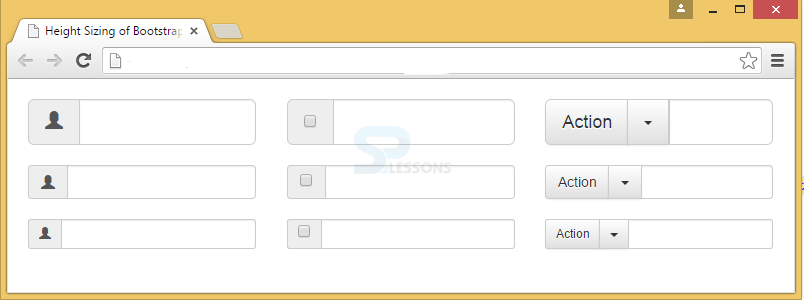
Key Points
- Bootstrap Input group is used in forms.
- Addons can be appended or prepended in the input-group class.
- Sizes of input group elements will be automatically adjusted once the elements are placed in .input-group when working with forms.