


 Description
Bootstrap Modal is similar to that of an alert message or a dialog box, which gives important information to the end user to respond promptly to a message.
Example
In the below example,
Trigger : The modal window is triggered with a button or a link and adds two 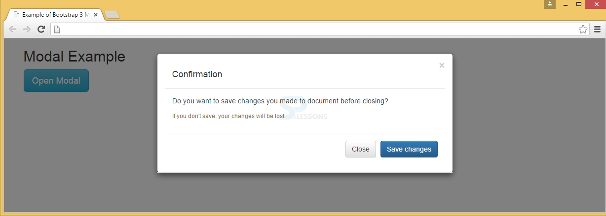
data-* attributes.
data-toggle="modal" : Modal window is opened by using this window.
data-target="#myModal" : Modal id is pointed by using this window.
Modal : The modal ID in <div> should be equal to data-target attribute value, which is used to trigger the modal ("myModal").
.modal class : This identifies the <div> content as a modal and focuses on it.
.fade class : Transition effect to modal can be applied by using this class, which fades the modal in and out.
Attribute role="dialog" : This attribute is used to improve accessibility in screen readers.
.modal-dialog class : Modal width and margin is set by using this class.
Modal content : The .modal-content class applies styles to modal (border, background-color, etc.). Modal's header, body, and footer can be added to <div>.
.modal-header class : defines header style of the modal.
data-dismiss="modal" attribute has a button that closes the modal when clicked and styles can be applied to the close button using .close class, and the header line-height is set by .modal-title class.
.modal-body : To define the style for the modal body .modal-body class has to be used.
.modal-footer class : This class is used to define the style for the modal footer. Note that by default this area is right aligned.
[html]
<!DOCTYPE html>
<html lang="en">
<head>
<meta charset="UTF-8">
<title>Example of Bootstrap 3 Media List</title>
<link rel="stylesheet" href="https://maxcdn.bootstrapcdn.com/bootstrap/3.3.6/css/bootstrap.min.css">
<link rel="stylesheet" href="https://maxcdn.bootstrapcdn.com/bootstrap/3.3.6/css/bootstrap-theme.min.css">
<script src="https://ajax.googleapis.com/ajax/libs/jquery/1.11.3/jquery.min.js"></script>
<script src="https://maxcdn.bootstrapcdn.com/bootstrap/3.3.6/js/bootstrap.min.js"></script>
</head>
<body>
<div class="container">
<h2>Modal Example</h2>
<!-- Trigger the modal with a button -->
<button type="button" class="btn btn-info btn-lg" data-toggle="modal" data-target="#myModal">Open Modal</button>
<!-- Modal -->
<div class="modal fade" id="myModal" role="dialog">
<div class="modal-dialog">
<!-- Modal content-->
<div class="modal-content">
<div class="modal-header">
<button type="button" class="close" data-dismiss="modal">×</button>
<div class="modal-header">
<h4 class="modal-title">Confirmation</h4>
</div>
<div class="modal-body">
<p>Do you want to save changes you made to the document before closing?</p>
<small>If you don't save, your changes will be lost.</small>
</div>
<div class="modal-footer">
<button type="button" class="btn btn-default" data-dismiss="modal">Close</button>
<button type="button" class="btn btn-primary">Save changes</button>
</div>
</div>
</div>
</div>
</div>
</div>
</body>
</html>
[/html]
Output:
Description
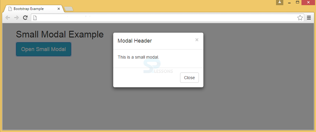
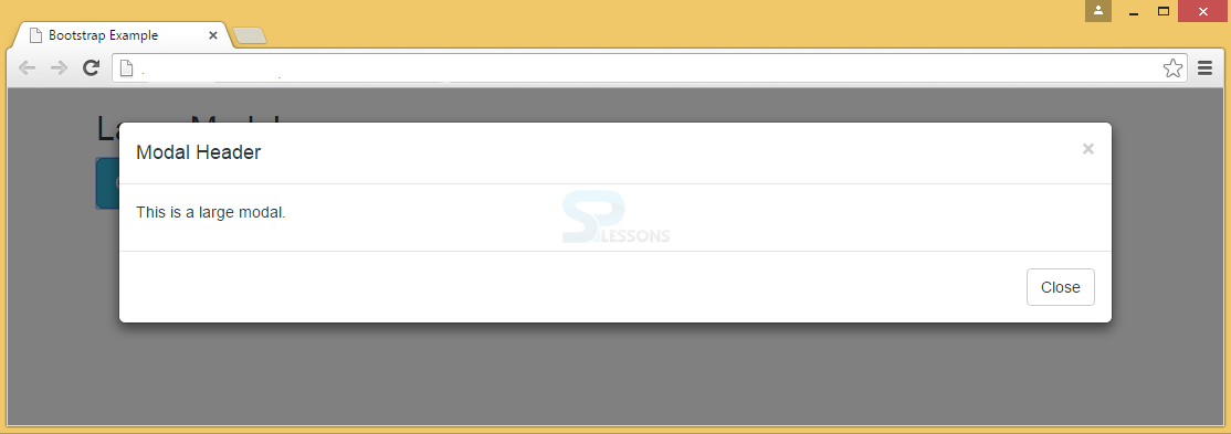
A Bootstrap Modal can be scaled up or down in Bootstrap. By using the class .modal-lg, modal size can be increased and with .modal-sm modal size can be decreased.modal-dialog.
Example
Below is an example for small modal.
[html]
<!DOCTYPE html>
<html lang="en">
<head>
<title>Bootstrap Example</title>
<meta charset="utf-8">
<meta name="viewport" content="width=device-width, initial-scale=1">
<link rel="stylesheet" href="http://maxcdn.bootstrapcdn.com/bootstrap/3.3.6/css/bootstrap.min.css">
<script src="https://ajax.googleapis.com/ajax/libs/jquery/1.12.0/jquery.min.js"></script>
<script src="http://maxcdn.bootstrapcdn.com/bootstrap/3.3.6/js/bootstrap.min.js"></script>
</head>
<body>
<div class="container">
<h2>Small Modal Example</h2>
<!-- Trigger the modal with a button -->
<button type="button" class="btn btn-info btn-lg" data-toggle="modal" data-target="#myModal">Open Small Modal</button>
<!-- Modal -->
<div class="modal fade" id="myModal" role="dialog">
<div class="modal-dialog modal-sm">
<div class="modal-content">
<div class="modal-header">
<button type="button" class="close" data-dismiss="modal">×</button>
<h4 class="modal-title">Modal Header</h4>
</div>
<div class="modal-body">
<p>This is a small modal.</p>
</div>
<div class="modal-footer">
<button type="button" class="btn btn-default" data-dismiss="modal">Close</button>
</div>
</div>
</div>
</div>
</div>
</body>
</html>
[/html]
Output:
 Below is an example for large modal.
[html]
<!DOCTYPE html>
<html lang="en">
<head>
<title>Bootstrap Example</title>
<meta charset="utf-8">
<meta name="viewport" content="width=device-width, initial-scale=1">
<link rel="stylesheet" href="http://maxcdn.bootstrapcdn.com/bootstrap/3.3.6/css/bootstrap.min.css">
<script src="https://ajax.googleapis.com/ajax/libs/jquery/1.12.0/jquery.min.js"></script>
<script src="http://maxcdn.bootstrapcdn.com/bootstrap/3.3.6/js/bootstrap.min.js"></script>
</head>
<body>
<div class="container">
<h2>Large Modal</h2>
<!-- Trigger the modal with a button -->
<button type="button" class="btn btn-info btn-lg" data-toggle="modal" data-target="#myModal">Open Large Modal</button>
<!-- Modal -->
<div class="modal fade" id="myModal" role="dialog">
<div class="modal-dialog modal-lg">
<div class="modal-content">
<div class="modal-header">
<button type="button" class="close" data-dismiss="modal">×</button>
<h4 class="modal-title">Modal Header</h4>
</div>
<div class="modal-body">
<p>This is a large modal.</p>
</div>
<div class="modal-footer">
<button type="button" class="btn btn-default" data-dismiss="modal">Close</button>
</div>
</div>
</div>
</div>
</div>
</body>
</html>
[/html]
Output:
Below is an example for large modal.
[html]
<!DOCTYPE html>
<html lang="en">
<head>
<title>Bootstrap Example</title>
<meta charset="utf-8">
<meta name="viewport" content="width=device-width, initial-scale=1">
<link rel="stylesheet" href="http://maxcdn.bootstrapcdn.com/bootstrap/3.3.6/css/bootstrap.min.css">
<script src="https://ajax.googleapis.com/ajax/libs/jquery/1.12.0/jquery.min.js"></script>
<script src="http://maxcdn.bootstrapcdn.com/bootstrap/3.3.6/js/bootstrap.min.js"></script>
</head>
<body>
<div class="container">
<h2>Large Modal</h2>
<!-- Trigger the modal with a button -->
<button type="button" class="btn btn-info btn-lg" data-toggle="modal" data-target="#myModal">Open Large Modal</button>
<!-- Modal -->
<div class="modal fade" id="myModal" role="dialog">
<div class="modal-dialog modal-lg">
<div class="modal-content">
<div class="modal-header">
<button type="button" class="close" data-dismiss="modal">×</button>
<h4 class="modal-title">Modal Header</h4>
</div>
<div class="modal-body">
<p>This is a large modal.</p>
</div>
<div class="modal-footer">
<button type="button" class="btn btn-default" data-dismiss="modal">Close</button>
</div>
</div>
</div>
</div>
</div>
</body>
</html>
[/html]
Output:
Points
- Modal gives important instructions to the user.
- Bootstrap Modal size can be varied by using modal-lg and modal-sm classes.